
- 1. Robby Leonardi.
- 2. Daniel Spatzek.
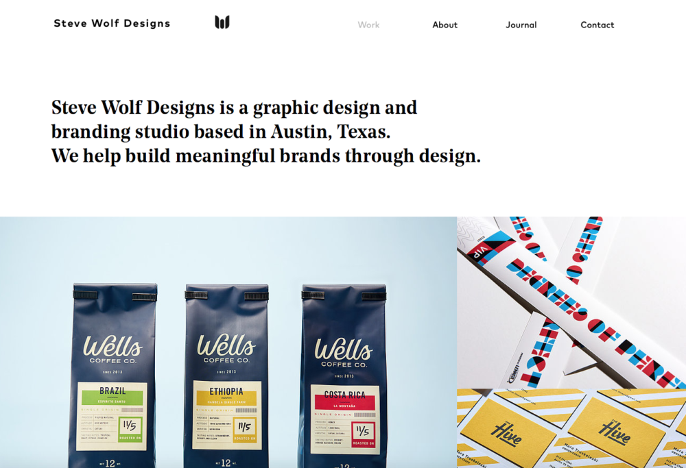
- 3. Steve Wolf Designs.
- 4. Yasly.
- 5. Josh Miller.
- Get a .design domain for just $5
- 6. Qode Interactive Catalog.
- 7. Denise Chandler.
- 8. Nathan Riley.
- 9. Denys Nevozhai.
- 10. Cher Ami.
- 11. Root Studio.
- 12. Rachel Cheng.
- 13. Jane Song.
- 14. Alex Coven.
- 15. Built by Buffalo.
- 16. Mike Kus.
- 17. Fuzzco.
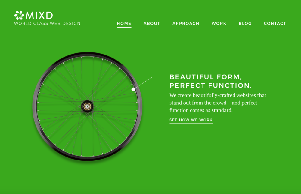
- 18. Mixd.
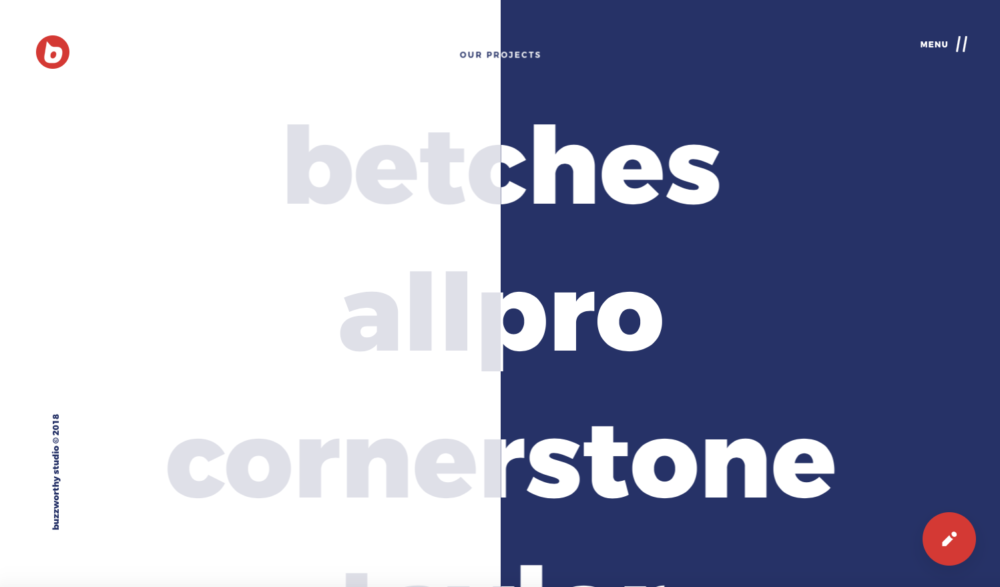
- 19. Buzzworthy Studio.
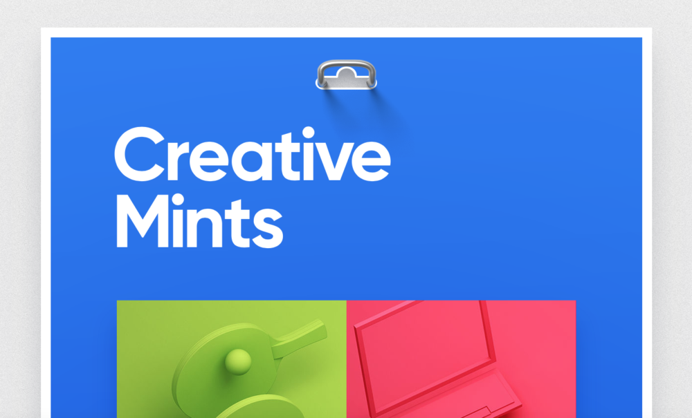
- 20. Creative Mints.
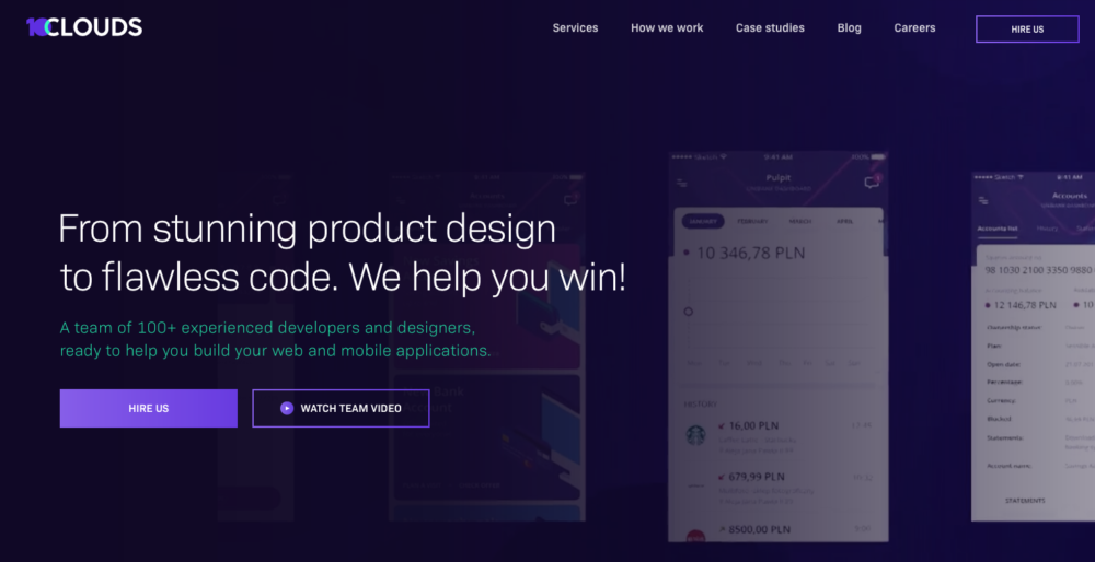
- 21. 10Clouds.
- Which graphic design portfolio is your favorite?
Looking to revamp your own graphic design portfolio? Or maybe you’re like us and just like to look at design portfolios and graphic design blogs to be totally inspired.
We’ve searched the internet for the best graphic design portfolios to give you inspiration to make yours look awesome, too.
Whether you are a new designer starting out, or an experienced designer with an advanced portfolio, these graphic design portfolios will certainly boost your creative mind.
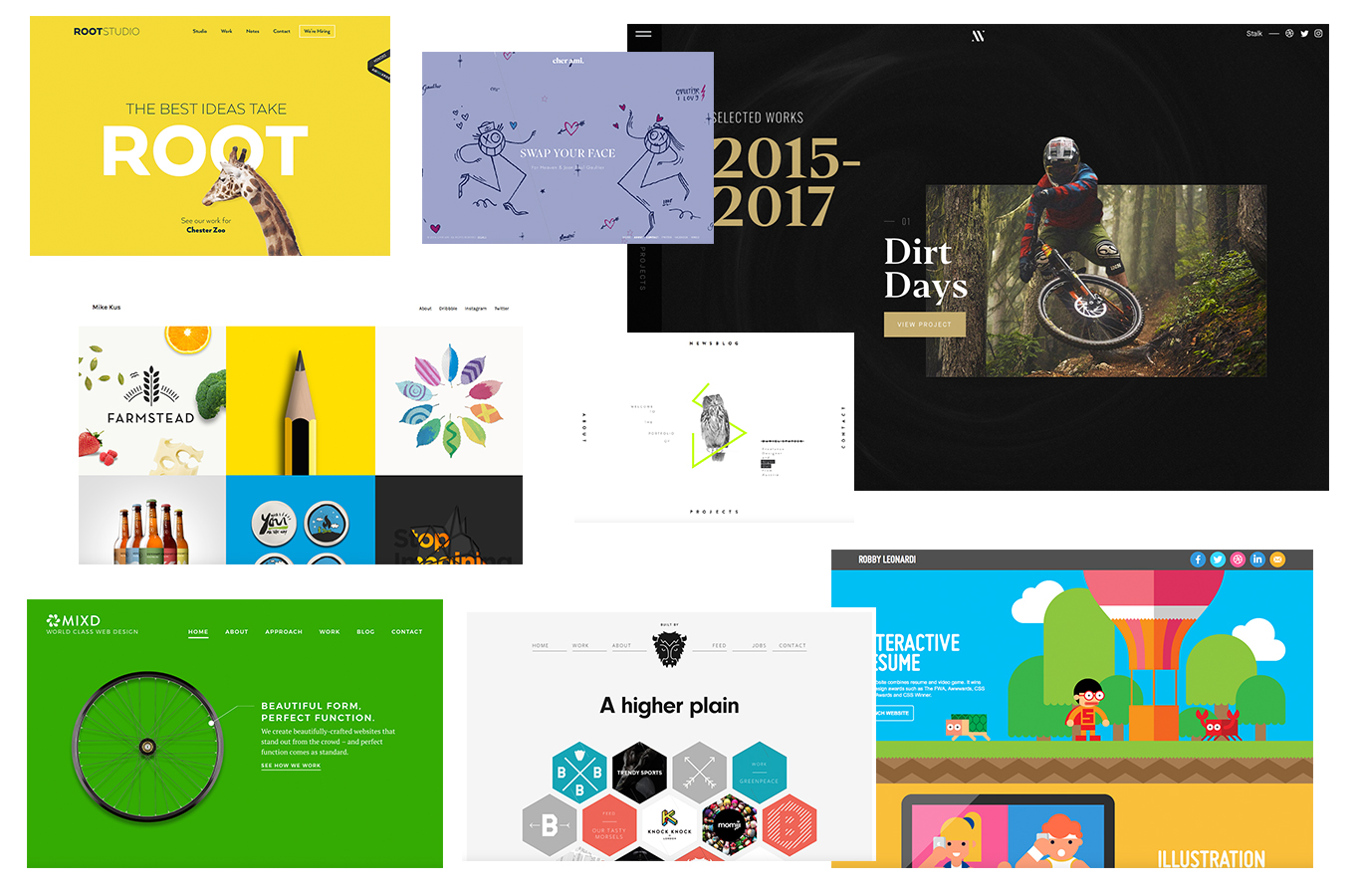
1. Robby Leonardi.
There’s no hiding what designer and illustrator Robby Leonardi does when you visit his design portfolio. Greeted with fun, bright colors and illustrations, he shows his expertise without saying a word. The coolest part? Click through to his resumé and reveal an awesome interactive illustration activated on scroll, much like a video game. Who knew a resumé could be so fun to read? We love it!
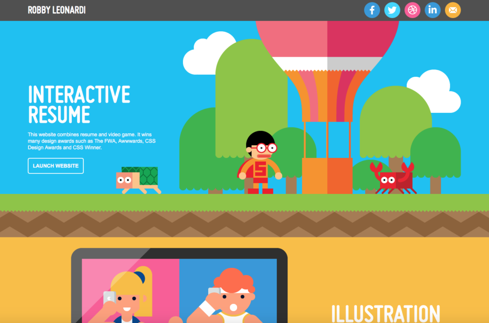
2. Daniel Spatzek.
Upon visiting the portfolio of Daneil Spatzek, you’ll notice a unique, but simple approach. Taken over by white space and a featured motion-graphic in the middle, it gives you a small look at his capabilities. Click through to the design portfolio and you’re taken on a new journey with scrolling graphics and typographic elements. He does an excellent job at drawing in the reader, and clearly displays his strengths.
3. Steve Wolf Designs.
Head on over to Steve Wolf Designs and explore the no-frills approach to their graphic design portfolio website. The uncomplicated design features a masonry layout on the homepage highlighting some of their best work. We can’t help but appreciate the ease of use and quality of design.
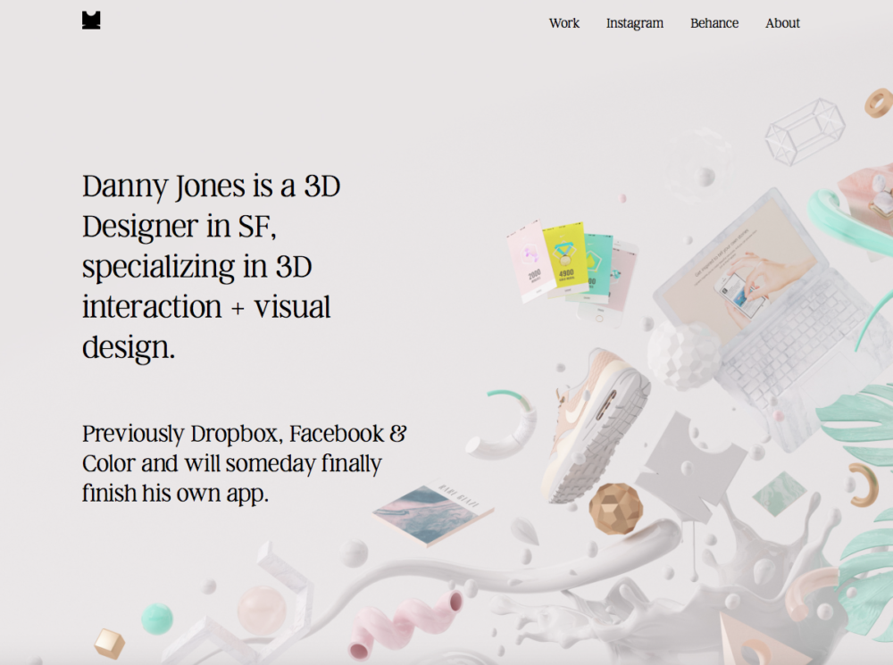
4. Yasly.
Yasly is the design portfolio website of Danny Jones. Specializing in 3D interaction and visual design, he lays out his work in an effortless way. What enhances the display of his graphic design portfolio is the ultimate quality of photography. In addition, the overall design pairs with the high profile of clients he has worked with.
5. Josh Miller.
The graphic design portfolio from Josh Miller of Australia combines uncommon color combos with simplified design — and makes it look good. We dig the navigation layout, and the bold in-your-face design that draws you in to view more. On page transition, Josh created a colorful wave-like graphic that keeps up the lively theme of his work.
Get a .design domain for just $5
Enter your domain below and check if it’s available.
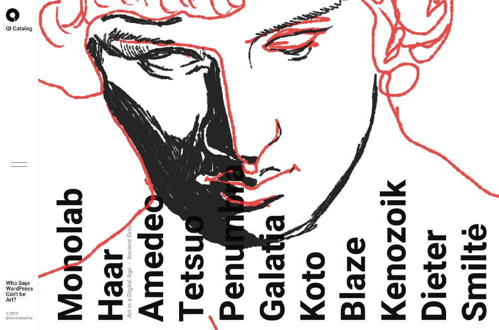
6. Qode Interactive Catalog.
Qode Interactive’s Catalog is a curated collection of WordPress themes that demonstrate the company’s authentic and modern approach to web design. While we were exploring the content, we felt like viewing artwork in a gallery space thanks to the interesting horizontal scroll effect used throughout the website. When you hover over the name of each theme, you’ll see a preview of its design, and on click, a theme’s project page will launch. The Catalog is designed in a minimalist, contemporary style, and it offers a great overview of Qode’s impressive creativity and skillset.
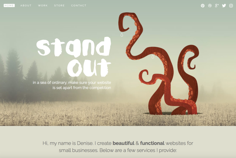
7. Denise Chandler.
Denise Chandler demonstrates how to execute a color palette in her graphic design portfolio like a pro. Usually, muted colors as such are visually deterring, but she utilized the array of hues that are extremely pleasing to the eye. On the homepage, she writes “In a sea of ordinary, make sure your website is set apart from the competition,” and we believe her design lives that to the fullest.
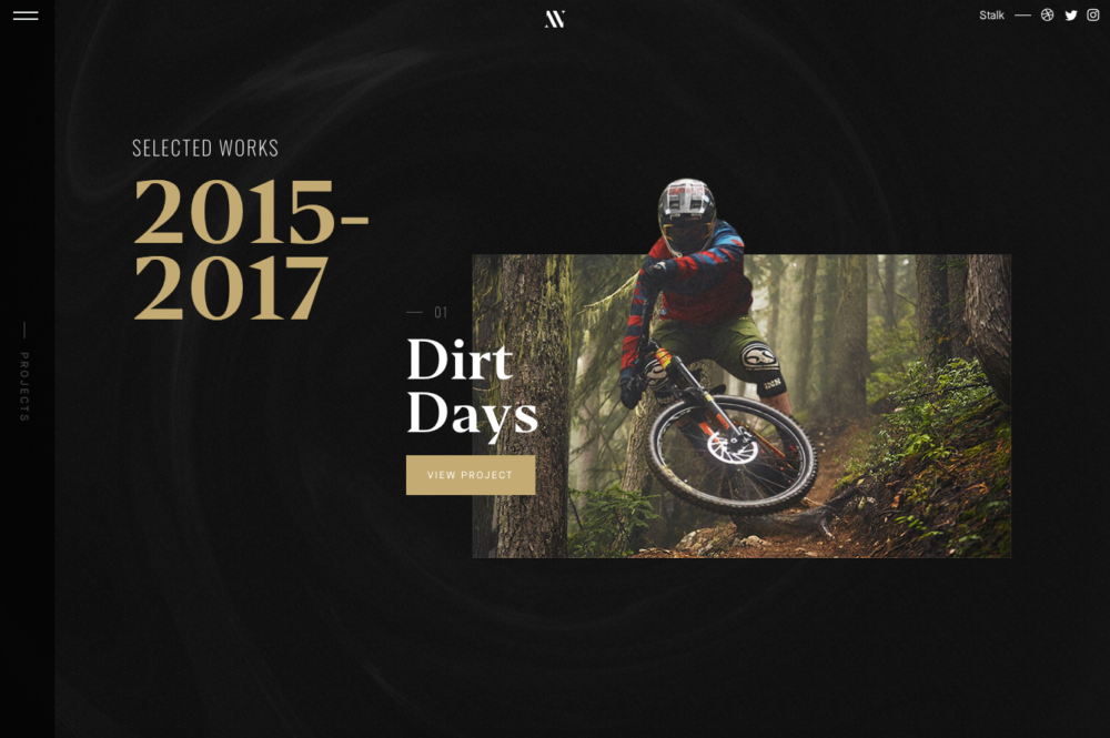
8. Nathan Riley.
Nathan Riley’s graphic design portfolio portrays elegance at it’s finest. We’re not sure if it’s the black and gold color combo, or the beautifully laid out design, but it instantly provides a spark of inspiration. His scrolling portfolio with motion effects is incredibly pleasing. Pair that with his exemplary work, and it’s no wonder he’s been on the receiving end of so many design awards.
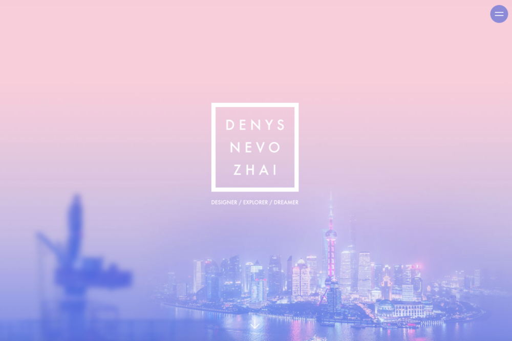
9. Denys Nevozhai.
Denys Nevozhai is a world traveler designer, and easily tells his story through an interactive timeline. We think this is a cool feature to allow others to get to know him and where he’s been. Scroll on past the timeline, and you’ll be introduced to a grid of beautiful work. His graphic design portfolio exudes a pretty basic layout, although his work is anything but.

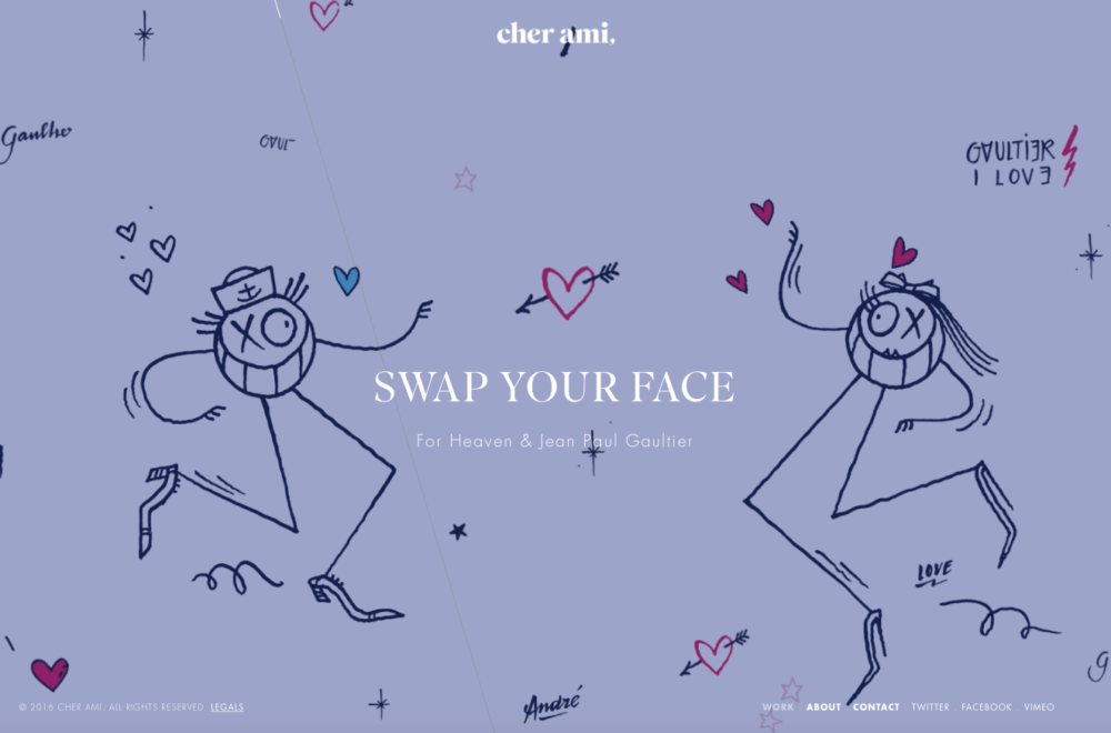
10. Cher Ami.
Cher Ami wastes no time in putting their work in your face. The full-width homepage submerses you in various projects with eye-catching video graphics and design. A subtle, thin line angled across the screen acts as a progress bar, showing you where you are at on the page. There’s no questioning that the studio at Cher Ami pushes the limits when it comes to graphic design portfolios on the web.
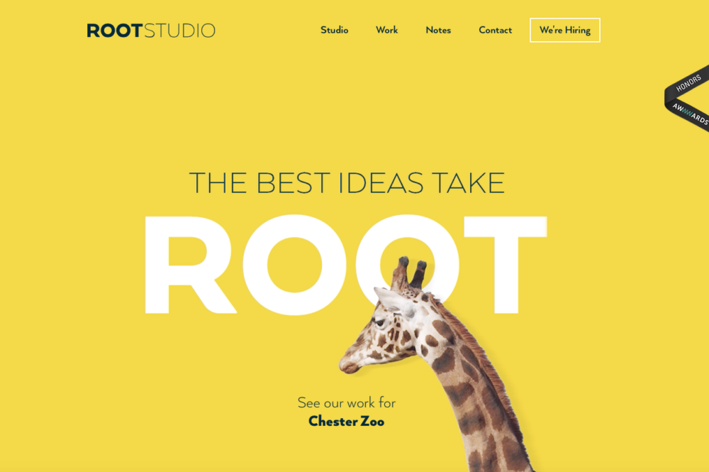
11. Root Studio.
Wow! This is our reaction upon opening the homepage of Root Studio’s graphic design portfolio. That bold, pop of color and incredibly unique animated giraffe will draw anyone’s attention. Like many others, they’ve put together a website that reflects the same look and feel as their work. You can’t wait to keep browsing, as the easy-to-read and uncomplicated layout is so inviting.
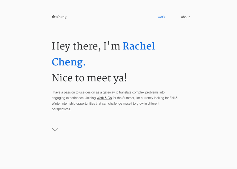
12. Rachel Cheng.
Rachel Cheng’s graphic design portfolio is minimalist at it’s finest. As a young designer, her work in UI/UX and product design is simply beautiful. On an individual project page, the breakdown of the process is executed well. With so few years experience, we can’t wait to see how her portfolio evolves.
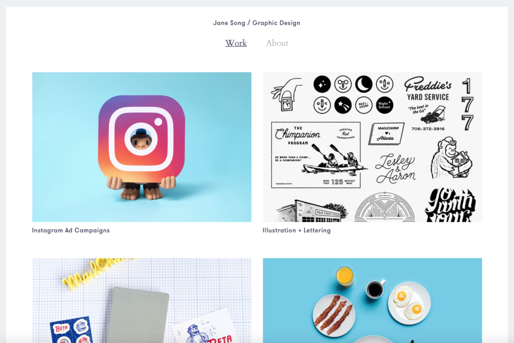
13. Jane Song.
The work of Jane Song is relevant and effective. Her graphic design portfolio (boasting clients such as MailChimp) is exceptionally simple, where she keeps the text to a minimum and let her work do the talking. What makes her portfolio so successful? The limited selection of only her best work and stripped-down navigation, which allows you not to get lost in the midst of admiring the work.
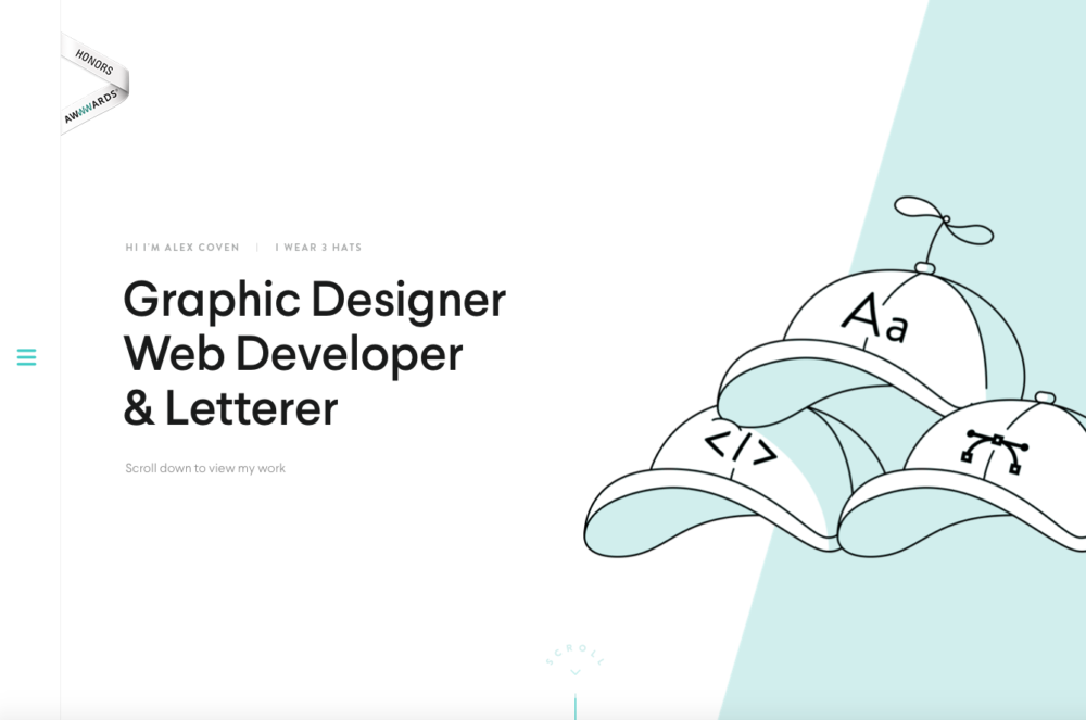
14. Alex Coven.
Check out Alex Coven’s graphic design portfolio and you’ll be told exactly what he does — you can’t miss it. Once you scroll down to view his work, the snap-to-grid scrolling feature and full-screen hero images exhibit his work exceptionally. We love the idea of utilizing every pixel of the screen, creating a no-distraction environment. Let’s not forget the clean and interactive logo/menu navigation on the left which converts to a nice mobile-friendly design when scaled down.
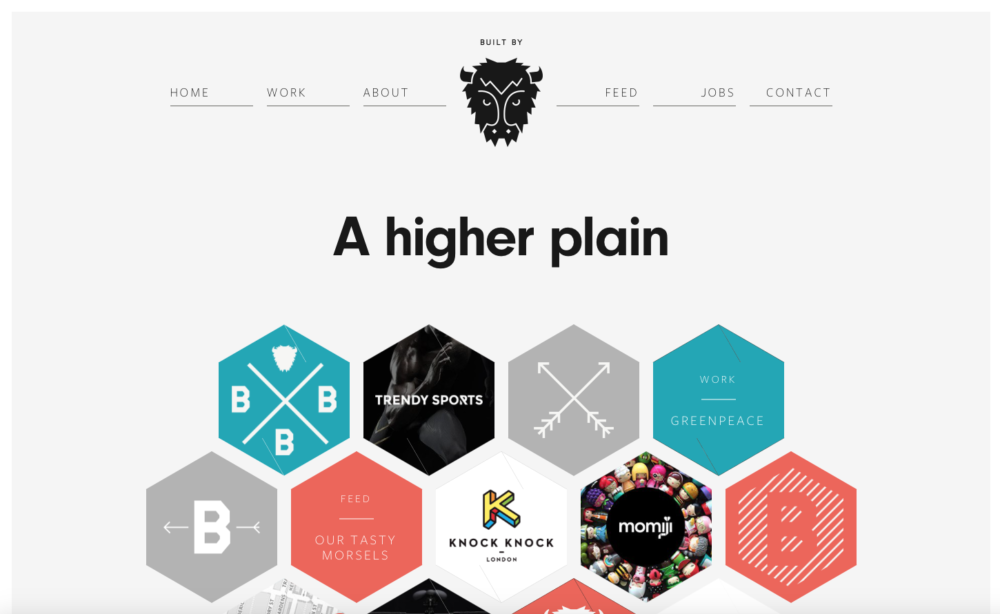
15. Built by Buffalo.
Built by Buffalo has a graphic design portfolio unlike any other we’ve seen. To portray their work, they created a honeycomb-like design with a small image detail for each project. Not only is it aesthetically pleasing, but very functional at the same time. The individual project pages are consistently well put together, with a clean two-column layout showcasing their work.
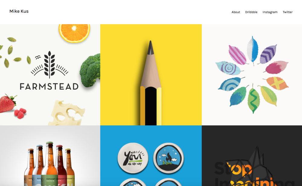
16. Mike Kus.
Mike Kus, a UK based designer, took advantage of the homepage by using it as a portal for displaying his graphic design portfolio. This eliminates any added clicks for reaching there, and it’s quite an inspiring wall of various designs. We are intrigued by the simplicity of the hover effects he’s implemented for each project. Additionally, the pop-up window feature to describe a project in detail is executed nicely, allowing the user to not have to navigate away from the homepage — the star of the show.
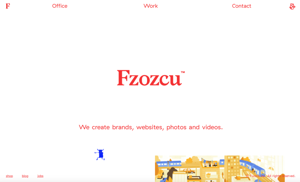
17. Fuzzco.
At first glance, Fuzzco’s homepage begins to do an automatic slow-scroll — a unique approach not seen very often. The fluid grid of work, with an occasional character-like figure running across the screen, is a visual experience. They took a monochromatic palette and implemented superb typographic hierarchy to create a one-of-a-kind portfolio site. Quirky graphics and large imagery tell their story of who they are and what they do.
18. Mixd.
Mixd takes color-blocking to the max, by displaying full-color backgrounds that are bold and dominant. This helps create sections of copy that make the information easy to digest. Their graphic design portfolio has a static homepage design that changes on refresh, keeping it interesting every time you visit. What works so well are the large headers and straightforward, minimalistic design.
19. Buzzworthy Studio.
Buzzworthy Studio, based in Brooklyn, NY, shows off their skills from the get-go with a distinct homepage design. Large headers reveal full-width images on hover, creating quite the experience. Click through to a project detail, and you’re led through a total design experience that’s branded to the project at hand. Buzzworthy’s project pages are the ultimate in detail — unlike any other.
20. Creative Mints.
The graphic design portfolio over at Creative Mints is just that — creative. A header design that mimics the look of a clipboard throughout, they carry out a design that’s quite incomplex, yet awe-inspiring. A lightly-hued background let’s the vivid imagery of their work stand out and be the hero of their portfolio site. The step-by-step photos of their process work grabs your interest, and displays their abilities.
21. 10Clouds.
10Clouds has a graphic design portfolio that prides itself on the finer details. With each project case study, they break down the statistics and problems they solved through their design — all while looking great and keeping you interested. The page layouts are dynamic and rigid, but smooth at the same time. 10Clouds demonstrates a great ability to display large amounts of information in a aesthetically pleasing way.
Which graphic design portfolio is your favorite?
We’d love to know which graphic design portfolio is your favorite, and how you’re going to use the inspiration for your own!
We’d also love to hear about your process for designing your own graphic design portfolio. Are you building a portfolio to show off your work or get more design clients? Are you using a freelancer WordPress theme or other portfolio templates to get started? Or do you prefer to build from scratch?
Share all the details with us in our free FB group for freelancers!
Keep the conversation going...
Over 10,000 of us are having daily conversations over in our free Facebook group and we'd love to see you there. Join us!


these are all very nice but they seem like very niche type designs, a lot of illustration and posters. To get a job you need to showcase a full brand execution. A lot of nice stuff but too artsy for a lot of real world applications. I know this because ever since i graduated design school where i could let my creativity run wild, i had to scale that back and find a nice medium between getting a clients message across and applying my own style within a certain time constraint.
Hello april,
Thank you so much for this HELPFUL tutorial. ????????????
Your inspirational design portfolios are really appreciable.
I am a logo designer, personally, sometimes I need to redesign my designed logos according to my client’s requirement.
logoai.com is an awesome online logo maker. This is so much easy to use. The most benefit to use it is: designers can save time & also can receive quality designs with logoai.com in a few minutes!
All are very nice with good ideas.
I also try to make my Portfolio. Need your know if this is OK. http://www.sahars.net
This is my portofolio
Thanks for adding my template “Jason”.
Nice collection of portfolios.
It helped me design my portfolio.
www.pierrebaptistebouillon.com/en
Aw, tһis was an extremely good post. Taking
the time and actual effort to maқe a good article…
but what can I say… І put things off a whole lot and never sеem to get nearly anything done.
wow! awesome collection 😉
Thank you for the good writeup. It if truth be told used
to be a leisure account it. Glance advanced to more brought agreeable from you!
By the way, how can we communicate?
With the advancement in adaptable Internet usage comes the subject of how to build locales suitable for all customers. The business response to this request has ended up being responsive web design, generally called Responsive web design.
Please could you show me how portfolios for a print designers are made? I am an experienced Graphic Designer who has made many print based designs so it will be grateful of you to show some of the print designers portfolio
Great collection.
If any of you graphic designers are looking for a printer that can (sometimes) get you better pricing than your vendors due to their purchase volume, give Printingworx® a try!
Thank you for this post I’ve finally got the motivation to create more impressive designs☺
Hey Rebecca, great content and even better design collection. Love, love, love them. I was inspired by some of the design ideas on here. Thanks for putting this together.
Now a day unique and stunning designs becomes a vital part of business. This article helps to know about the web design services in India, which helps to improve the various business services.
I really really like your collections. Some of them inspired me as well. I’m completely redesigning my portfolio.
This is really an informative blog for all the beginners. The blog is absolutely fantastic. Lots of great information which can be helpful to understand about web design.
Thanks for sharing.
Great article. It is absolutely important to understand the role a great design towards a successful business. A great design can have some quick wins.
Nice Article! Great inspiration thanks for sharing!
Hi, I’m in Maine too and looking for branding design and graphics for a new business I want to launch.
Hi Millo
Thank you for an excellent article.
Hi April Greer !
As I am a Graphic Designer, You inspired me a lot of by these portfolio. These are really creative segments. Hope, I can share my portfolio with you soon. Thanks
Very inspirational site.thanks april
Thanks so much for showing all of these unique design portfolios, but I have a dilemma that I’m hoping you could help me out with. I’m just now starting to build my own portfolio site and I’m running into the problem of my name being too long. Is there anything against having a unique hosting name instead of:
your full name (graphic designer).com ? Is it unprofessional?
Nice free WordPress themes & good themes details!!!
Thank you! I have long felt this way.
I cannot stand these proud ‘GEEK’ designers and their whole nerd sub-culture which has taken over not only design, but movies, music, architecture and anything to do with aesthetics.
Yeah, those proud designers and their really well built online content. how dare they!
ever heard of building an actual CAREER bub?
Producing Company Potrfolio is actually difficult however because of businessportfolio. internet support. They’re providing an array of profile composing support. We additionally adore all of them for their inexpensive cost.To know more business portfolio.
Great! Thanks for listing such useful information.
Good portfolios for inspiration.
The graphic design portfolios are from many brunches of design. It would be great if it is classified e.g web design etc.
Nice web designs you listed here. I am planning to update my website and here I find great ideas of web design which should be consider.
Hey! this is amazing portfolios list. just checkout this one “http://responsivecss.net/”, hope you will like the collection of responsive designs.
I found the websites to be too much of a random search to understand the designer. I was not willing to take the journey. I do not find any of these websites to be successful. The navigation was terrible. I did not know where to click. Some clicks worked while others went no were. I also did not like the multiple windows that opened in some of the sites. I feel that more importance was spent of trying to look cutting edge rather than to showcase the designers work.
Great collection of portfolios. I enjoy to take a look at them. Thanks.
Good post. I learn something new and challenging on websites I stumbleupon everyday.
It’s always interesting to read through content from other writers
and practice a little something from other websites.
Amazing examples! Check out this too: http://diorama-studio.com
This is a great collection of websites! Thank you for sharing and explaining what you liked about each site. Especially because I’m in the middle of putting my website together. Hope to share it soon. 🙂
LOVE, love this article. I appreciate it!
LOVED: http://www.nineliondesign.com/
I dislike my (our) site and am in school to learn the tools to change. I am at a point of “Portfolio” and really enjoyed the journey of this set of sites and how you provide guidance to inspire a look.
Maybe when I have completed my course and Portfolio I might end up on your excellent venue.
Very inspirational sites. I wish my website www.fahadkhalid.com also should have been there 🙂
Your links are very helpful, thanks!
My website is a work in progress… any comments would be helpful. Trying to code it myself though I am a beginner.
This is really beautiful, I like what I see. Good job
Wow, this was really inspirational! Thank you! I am still just a beginner, but I really love seeing such strong design work for inspiration. I would love to be half as good as these designers.
Good designs gives me lot of help for creating my own portfolio nice work . I recommend this to all who wanted to create their own portfolio plz read this article first.
Very good list of portfolios!
Has a great range of quality designs, it did help me complie a few things on my new portfolio site take a peak – http://deanlynn.com – let me know your thoughts!
Dean,
Very nice. If I may, a few suggestions:
– The scrolling element doesn’t fit in the box.
– The bottom feels like it needs some more polish. Everything else is very designed, but the text and footer are just text – no textures, no fancy header, etc.
– In America, we spell tailor-made with an ‘o,’ not an ‘e.’ Is it different in the UK?
– Your blog page header is off-centered with the rest of the page.
Really nice layout! Thanks for sharing!
I am glad that I came across this posting. I’m working my way back into designing again after a 2-year hiatus and a job in a different industry. I just updated my portfolio, but as a designer, I almost feel like crumpling it up again.
Like a previous reader mentioned, I too love the fact that you actually took the time to describe what it was that you liked about your picks. While researching for my most recent design, I would try to take my own notes while looking for inspiration, only to find myself overwhelmed and borderline brain dead.
Feel free to take a look at mine as well. I’m always open to suggestions!
Really like your list of blogs! It helped me a lot making mine at www.fatshape.com. I would be glad hearing any opinion, comment etc. Thanks!
Davor,
Really nice site! Thanks for sharing!
Gonna go through all of these portfolios soon. Good stuff!
Tarlan,
Awesome! Thanks for sharing the link.
i do not profess to be a web designer, but some of the things that struck me about most of the sites selected are the clutter, confusion, and basic coldness most of them have. they seem to have sacrificed focus. realizing that they are trying to show case as much product as possible, it seems to come at the expense of my being willing to sort through the visual morass of too many unfocused web tricks, hoop jumps, and the indiscriminate use of the over used table function. another thing that i found bothersome is the praised minimalism. we are human beings who require some personal connection to anything in our envirenment we must interact with. minimalism is at root a fallback discription for the unwillingness or inability of the designer to supply the viewer with a context or reason for him or her to have an interest in the subject. minimalism is a very tired design fad that no one in the design profession has the courage to declare dead and a product of a long past error or era. since the end goal of most sites is to inform the viewer of the site’s subject matter and/or sell a product, most selected sites are so unfocused that these basic fuctions fail. lead the customer or viewer in a stepwise fashion through the site and he will make the decision the designer wants him to. provide too many confusing images and unnecessary trendy web tricks and the viewer/customer will do something else with his attention, time, and money. simple human interaction and traditional sales rules are always the paramount guidelines for convincing a viewer to continue doing the thing the designer wants him to.
Joseph,
The purpose of this post is to highlight the many, varied types of portfolios one might endeavor to make. Each business has its own audience and goals and therefore tailor their portfolio to that audience.
As such, I’ve provided a list of 50 portfolios that fit into several categories so as to have relevance for a wide audience and to challenge designers to think outside of their comfort zone when creating or redesigning their portfolios.
There are certainly portfolios mentioned here that each person will and will not like. That doesn’t mean they’re ineffective or “bad,” it just means that we have different opinions and that’s a-okay.
Hope you found something positive to take away from the post!
Wow. These are all really beautiful. Some great inspiration here and now I feel like my site is so basic and elementary that I’m glad I had already decided to redesign it. lol. Thanks!
This is great. Any new examples of portfolios using responsive design?
Thanks!
Interesting selections. I am wondering if I have to many samples on my site. It is, however, multipurpose, as i am looking for a position, but also am open to taking on clients.
Anni,
Remember, a portfolio is all about quality, not quantity. Pick your best pieces and showcase them!
It’s perfect time to make some plans for the future and it is time to be happy. I have read this post and if I could I wish to suggest you few interesting things or tips. Maybe you could write next articles referring to this article. I desire to read even more things about it!
Some I liked, but many had cheesy effects and themes that distracted from the purpose of the site.
Dan,
The purpose of this post was to highlight some of the great aspects of a variety of different websites and website styles. I hope that whether you liked them or didn’t, you took something positive away from the post.
April
Great collection- its not often I go through all 50 websites on a “Top 50” list but this was well worthwhile. Thanks again.
Carlos,
Thanks! All 50?! That makes me feel really great.
April
i just Started my Graphic design site, http://giantdesign.biz , i hope i could learn more Tips and trick from you site…Thanks
I like a designer’s website that makes the work itself pop, without a lot of distractions, and makes it quick and easy for potential clients to look through. I sometimes wonder if mine is just a little too boring though. What do you think? www.jhigginsdesign.com. Thanks for compiling this nice list!
Jane,
I think the slideshow goes just a touch too fast. I feel like I don’t get enough time to absorb each image.
I really like your site, but I think you can work to strengthen the home page. I really like your simplicity overall.
Thanks for sharing – it can be scary to put yourself out there for review.
Great Collection . . . Nice site and inspirational.
“I’m new to the Graphics World – so a big thank you for putting these out here … Cheers !!!”
Hi April,
Thank you so much for this great compilation, it will be very useful for me as I’m currently re-designing my website www.zapiram.es. I’ve always been a fanatical defender of flash technology, but for some incomprehensible reason it seems to be excluded from many new devices and operating systems… So it’s time to undertake the html and css adventure 🙂
http://www.zapiram.es has been online with the same layout for almost five years now… I’m feeling like changing!!
Thanks mate. This is Rahul here, owner of iamrahul.com. You got some nice collections. All the best everyone.
Rahul,
You’re welcome – thanks for stopping by!
Thanks for including Authentic Style in the list. Much appreciated!
Will,
You’re welcome – you deserve the credit!
Thanks for stopping by to comment,
April
Great list of links.
Thanks – hope you find inspiration!
April
Wow! thanks a lot for including me in this list! and also love your comments, thanks again!!
Jenaro,
You’re welcome – you certainly deserve the credit!
Thanks for stopping by!
PS – Your chair looks pretty comfy. Is it, and where did you get it?
Great inspiration, I am definitely bookmarking this!
Thanks for adding a minimal category, some of these sites are incredibly beautiful. I personally feel that some designers get *just a little* too “artsy fartsy” sometimes; I’ve even had clients comment on that. But to each their own.
For the record, I was all about the grey BEFORE it was trendy 😉
Sheila,
You’re welcome – I tried to include several categories as each designer has their own vision for their site, and sometimes experimenting out of your comfort zone is a good thing.
Duly noted – you’re ahead of the trend. Must be that you created the fad! 🙂
Haha, I wish! 😉
Great article. I only browsed through a few of the sites listed, but it was very informational. I’m finishing up my website/portfolio and your comment/the section on the Call to Action was the most helpful for me. Thanks for pulling this together!
Rachel,
You’re welcome! Thanks for letting me know. We’d love to see your website when you release it to the world – post a link to it here!
Nice article! I am actually in the process of revamping my site(again) and this really gave me some insight.
Sydrena,
Glad I could help! Do share when you’ve got something to show us!
This will be great inspiration, as I am currently working on a new portfolio! I like the description lines, but personally I like these posts to include pictures of the website instead of tabbing every website and then come back here to see why you choose it. But that’s just me, anyways thanks!
Johnny,
I don’t disagree with you, but I will say that would have been quite a bit more work!
Also, I kind of wanted to focus on the name of the designer/business rather than the image of their portfolio. So often I see something neat and can’t remember the name or URL to return, so I thought by putting the focus on the name, perhaps it’ll stick with readers who designed the portfolio.
Designers will always be the star in the shadows, but hopefully this helps get their names out there a bit more!
Thanks for your input! Let us know if you find any particular favorites!
I would really like everyone to have a look at http://www.pepde.com and comment your opinions about it 🙂
Deepak,
First, I really love the sliding yellow bar under the navigation. I also really like how you use yellow so well – the yellow/white combo is very difficult to pull of and you’ve done well.
I feel like you lose a bit of real estate on the home page by having so much white space around your main “You are here…” I also think it would be great to carry your not-quite-circular shape throughout the website rather than having some circles and some unique shape.
It would be cool if in your portfolio you could scroll through the projects in the pop-up box rather than having to click in/out and go through the animation. But I do like the horizontal scroll at the top of the website.
In regards to your logo, the D for me is too abstract. If you hadn’t asked me to go to pepde.com, I would’ve told you your design studio is called Pep E. I don’t dislike the D shape or the bright, bold red, but I don’t get a D out of it, either.
Also, not sure if this was on purpose, but your spelling of Jhon is (in English) incorrect (should be John). If Jhon makes more sense for your location in India, ignore me.
Overall, you’ve got a very nice, clean site. Good luck to you!
Note: pull off, not pull of. Sorry.
April,
Thanks a lot for such a detailed and true review on my design.
I will definitely consider these opinions & fixes and include them when Im revamping the design especially the loss of white space in home page.
Regarding the logo,I do know it is very difficult to figure out pepde from it still I don’t know why I love it so much that Im finding it hard to change but always I do try to come up with some solutions.
I am sorry,can you point out where I had made the mistake jhon for john(it is the right way of spelling it) so that I can correct it.
Once again thanks for taking time reviewing my website 🙂
All my wishes for your work.
Deepak,
You’re welcome!
I certainly don’t dislike your logo, but it is hard to read. That’s for you to determine. 🙂 It’s yours!
Your “John” error is on the contact page in the contact form – http://pepde.com/contact-us/ – super nit-picky, I know.
Best wishes to you too!
I like your “short blurb,” I hate it when I come across a list post like this and there is no description as to the reasoning behind the choice.
While a lot of these are outside of my ability, I do enjoy looking around for those little sparks of inspiration. In my opinion, I think that a lot of designer portfolios are a bit over the top just to be different, what do you think? I understand that you want to, and especially in this business – need to, stand out from the crowd, but often times I find myself overwhelmed by the design.
Also, good timing! I’ve been working on my portfolio for the last few days, and this has been a great inspiration. I’ve seen some things that I want to incorporate, and some things that I’d like to avoid for my particular purpose.
Ricky,
I completely agree – I hate to go to a list and not have any idea why each item is on the list!
You’re right, some people go for different, some for fancy, cool, modern, etc. This is why I categorized them into different groups. You may, for example, like the minimalist look, so maybe you focus on those, while others are interested in sliding and moving parts so they check out that group. And you’re also absolutely right in that often we visit sites and find out what we DO NOT want on our own!
Ideally, you’ll create a portfolio that fits your style, your audience, and your work.
Good luck, and please do share when you’ve got something to show us!