So in order to smoothly transition from the design stage to printing, what processes should you put in place to avoid expensive (both in terms of finances and sanity) mistakes? It’s essential that you thoroughly proof your documents before going to the printers. Everything needs to be perfect, saving you time, money, and reputation.
If you have doubts about how something will look on paper, you should review our list to determine the best printer for graphic design and get a general idea of how your design will look in the real world before you take it to a professional printer.
If you’re sure you’re ready to go, here are some simple guidelines to follow:
Timing is critical
Discover your printer’s turnaround times before starting your project and plan your project milestones accordingly so that you can get your work into the printer’s hands on schedule. Missing your deadline could mean that your run can’t go ahead until your printer has freed up enough free time, which could be anything from days to weeks.
You should also plan to allow enough time for the printer to run your job twice, in case there are any errors in printing, machine failures, and any other unexpected delays. Planning guards against panic around the deadline and is essential to getting your product printed and delivered to the client on time and according to specifications.
Embed your fonts for accurate reproduction
You shouldn’t expect your printer to have a huge collection of fonts, especially the more eccentric ones in your library. In order to maintain your design’s integrity, embed your fonts directly into the document that you are printing. This will prevent font substitutions which can occur when the printer does not have your exact font. As any designer will know, there is a distinct difference between Garamond and Bookman, Courier and Times, so it’s well worth taking the time to include your font files with the document!
Print size matters
One of the most common mistakes made when printing is sending a document that is too small, which, if not corrected before the final run, can result in a printout that is fuzzy and lacking in clarity due to a lack of resolution. It’s imperative that you create your document the same size as it will be printed in order to avoid this embarrassing end result. Designing at actual size reduces the margin for error with graphics, fonts and layout once printed. Without taking adequate precaution, you’ll soon find that something that looks great on your screen soon turns into a design disaster when printed in the large format for which it was intended.
Proof your document thoroughly
Most designers have been there. You’ve sent your final piece of work off and had it printed up, only for the client to call you a couple of days later to tell you that their telephone number or web address was incorrect. What a nightmare! And one that often costs you a lot of money, or worse – a damaged reputation. It is essential that you allow yourself plenty of time to thoroughly proof your document for any typographical, punctuation and grammatical errors. Remember that a misplaced comma can dramatically change the meaning of a sentence, or a missing period or hyphen in an email address can make it impossible for customers to contact your client. One of the best ways to proof your copy is to read it backwards at least once. It may sound illogical, but it makes it much easier to spot any glaring errors.
Check your image proportions, dimensions and resolution
Your images should fit the size of the document, but even if you get the actual size of the image correct, don’t forget to check your resolution is high enough. Discrepancies like bitmapping and quality degradation can occur in images which are dramatically enlarged from their original size, a costly mistake resulting in a thoroughly amateur finished product. In order to get the best results in terms of finished product, make the resolution of your images 300DPI, the highest print resolution used at most print shops.
Consistency is key
One of the things that separates a highly successful brand from the rest is consistency in their presentation and style. With this in mind, make your margins consistent throughout your work, especially on multi-page documents. For booklets, page margins need to be equal on both the inside and outside. When you change something on one page, make sure that change is repeated on every other page, as anything else will look awkward and unprofessional. Look for consistency as part of your final proofing.

Convert your graphic to CMYK
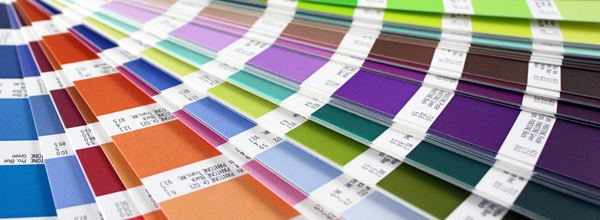
As you would have learned very early on in life, every color in the rainbow is created with a mixture of cyan, magenta, yellow, and black. To avoid costly color correction, convert your document from RGB to CMYK. Despite seeing no differences on screen, the printing difference is dramatic. It’s a small tip like this that can literally make or break your design, and save you a pretty penny at the same time!
Print out a proof
One of the easiest ways to ensure a quality finished item is to print out a proof of your design and give it to your printer so that they can clearly see the copy quality, colors, and finishing options which you wish for your document. You could also provide some notes to add extra clarity and eliminate any questions which may arise during the printing process. An added bonus is that when you provide a proof, it becomes the printer’s responsibility to live up to your expectations.
Bleeds
A document has bleeds when it is printed to the edges of the paper. This is a commonly seen practice in flyers and business cards. The standard bleed for your document should be 3mm to allow for any variations in printing and cutting.
Software
Printers can accept many document formats, including the usual culprits like Illustrator, InDesign, Photoshop, PDF, Microsoft Word. However, it’s worth taking the time to make sure that your documents are in a format which is native to the printer’s machine – failing to do so could result in a lengthy, costly delay. Converting non-native files into readable formats usually results in layout errors, so if this is something you have to do then you’ll need to proof it all over again. Ensure that you are using the best document collection software possible.
What else?
There are many factors which must be considered before sending your documents to the printer. Make a list of pre-flight guidelines to keep near your computer. Printing perfection can be achieved with pre-flight care. What other tips wouldyou add to list? Have you had any experience with any of these common issues?
Keep the conversation going...
Over 10,000 of us are having daily conversations over in our free Facebook group and we'd love to see you there. Join us!


Hi John you have done a great job by posting some informative point regarding make a file print ready. I think developers can take a benefit from this post
Hi, for the “Software section”, what kind of others non native files that you are referring to ? Is it .tiff or etc? I not so sure about the others better files for printing in design works. Thanks for your comments.
I need to make sure that my design is printed correctly, so hopefully these tips will help me out. Your tips for printing out a proof seems like a pretty easy way to make sure this is done. Printing a proof of my design and showing it to the printer seems like a good way to make sure that I get the right colors and finishing options that I need, so I’ll be sure to do that. Thanks for the tips!
Hi, for the “Software section”, what kind of others non native files that you are referring to ? Is it .tiff or etc? I not so sure about the others better files for printing in design works. Thanks for your comments.
James,
thank you for bringing up this subject.
There’s one issue that has been given me a lot of headache and frustration.
Sometimes when you start or even when you complete a project, you don’t know who the printer will be. Even in which country or area they will be located.
One of my examples (I could give several): I’m living in Haiti, bought my latest computer in Barcelona, where I come from, and installed Adobe Suite, which decided I’m in still in Europe as colour parameter is concerned (via synchronization in Bridge).
The first project with that was a havoc with colors.
The printers never gave me a chance to correct this issue.
I did some research afterwards, found this synch color issue in Bridge, but the options available are several options for Europe, North America and Asia. The rest of countries or printers have to align themselves.
I’ve tried the different options available in North America but to no avail for the printers decided on their own (in a 4th issue of a 8-page bulletin, for instance) to turn a textured blue navy background in 6 out of 8 pages into something bland clear pink without texture, blue background into fuschia in a article written by a big feminist lady who passed away in the terrible earthquake in January. Bland pink plus fuschia, without texture, from blue!? They decided to from uncoated to coated paper.
In other projects, before, they had eliminated a lot of transparencies and brought back a lot of things that were not there to communicate, that even added a problem of readibility. Aaaarg.
Ah, James and others who may read me, I am not the type who complains, on the contrary, I’m always strugling to win the battle, but sometimes printers, clients, schedule are at odds.
Schedule is another story, for there are occasions your client pays the 50%, and then they don’t give you all the material to begin with, or they give it to you but the resolution is no good at all. And given that they have other things to do, it takes several emails with phone calls to remind them we have business in our hands. Days, weeks, and afterwards they are in a hurry.
One almost last issue, about your “print out of proof”, our printers are RGB, printer printers are CMYK, we have a problem. We produce our documents in CMYK, but print them in RGB for the printers. Logically it’s not the same colors!
James, when you say embed fonts, in theory, pdf will embed them.
For all the other issues in your article, I extremely agree with you. That’s my way of life work and work life.
And last, but not least, and to add up to my first point. One of my actual projects, a book of photographies, the client says he will find a printer in Asia, he wants quality and he doesn’t know a thing about printing. That would make me synch all Adobe suite via Bridge to Asia. But he’s not my only project in the moment!
I hope my comments full of experiences has lead your article a bit forward. I’m still looking for answers all the way in the net.
Kenbe la, take care,
Mireia
paper matters also, coated or uncoated colored, bleached etc…
Question:
I design Identity cards in InDesign which are Plastic PVC Card as in:http://goo.gl/hxYTe. I wanted to know if I should make the design in RGB or CMYK as this technology is implemented through Inkjet Printers which are generally RGB printers (I guess)
If you don’t want to read that essay/bio/short story, then here’s the answer: CMYK. (I work in a print shop)